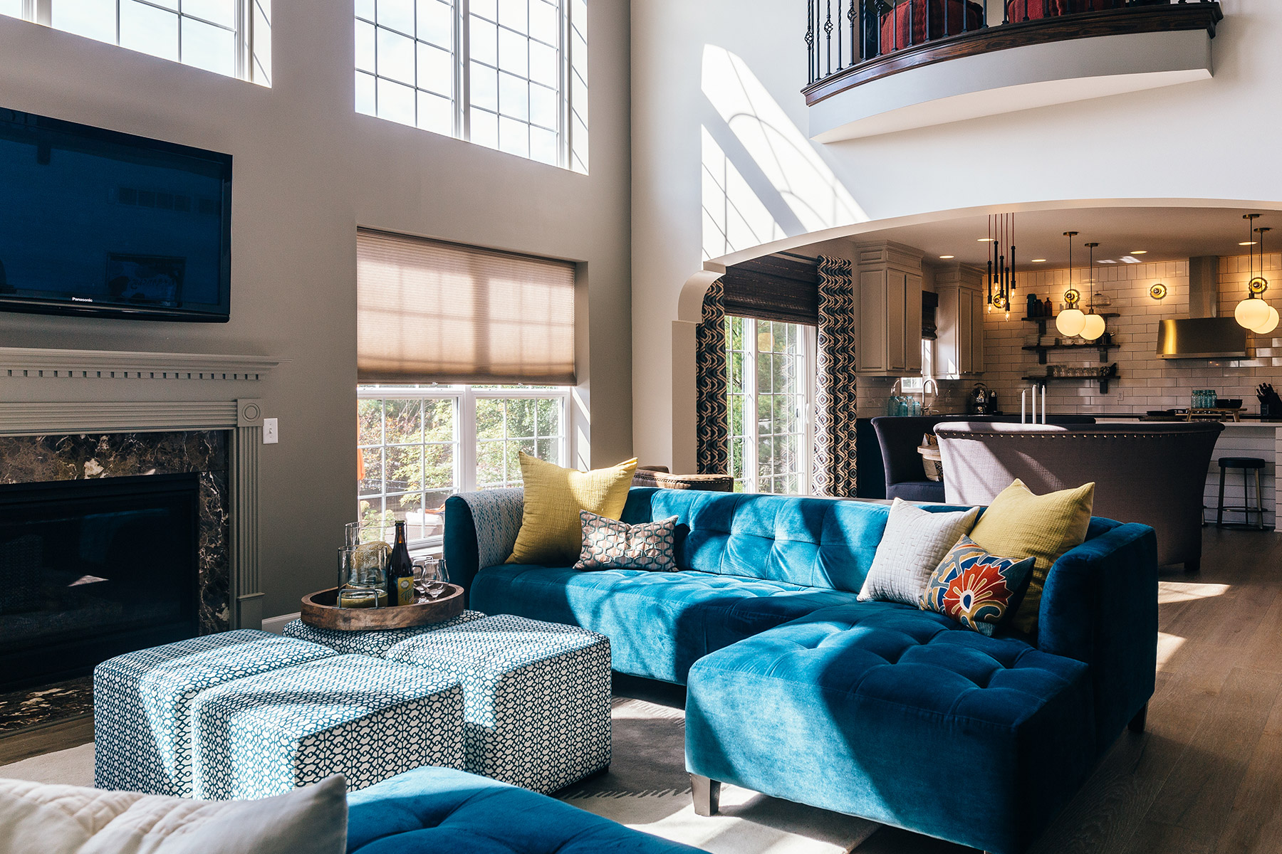
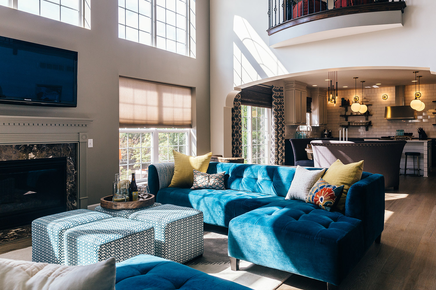
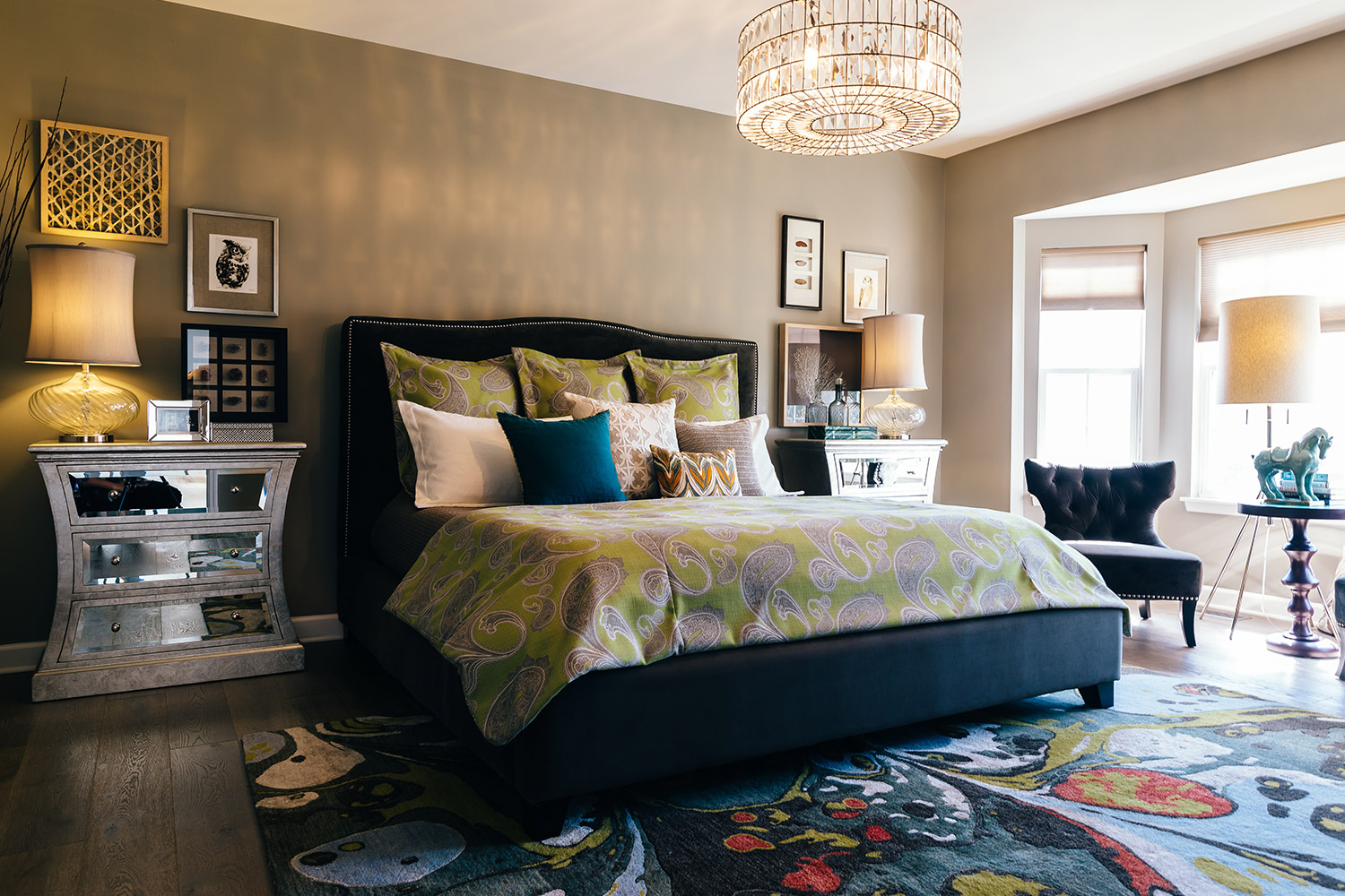
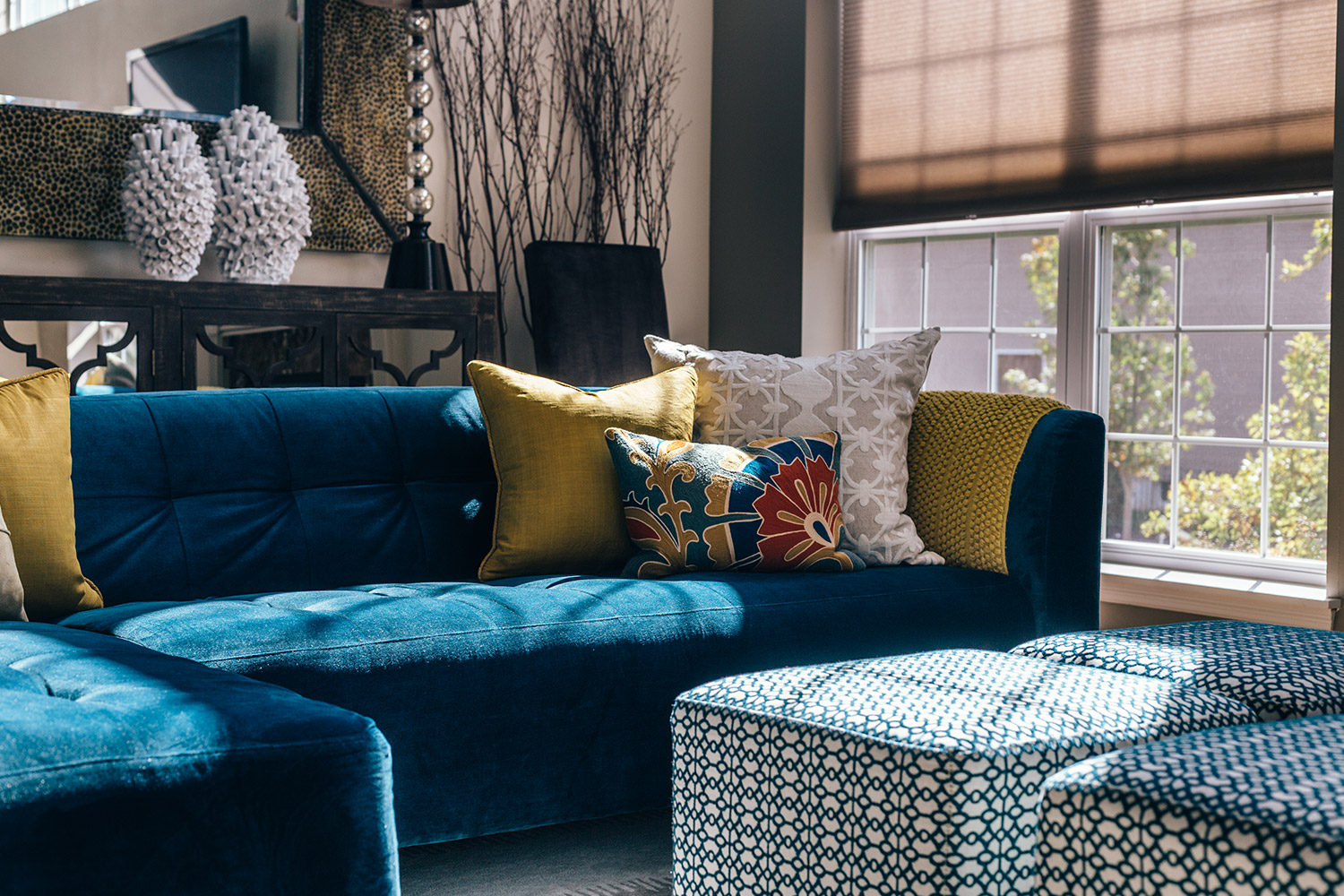
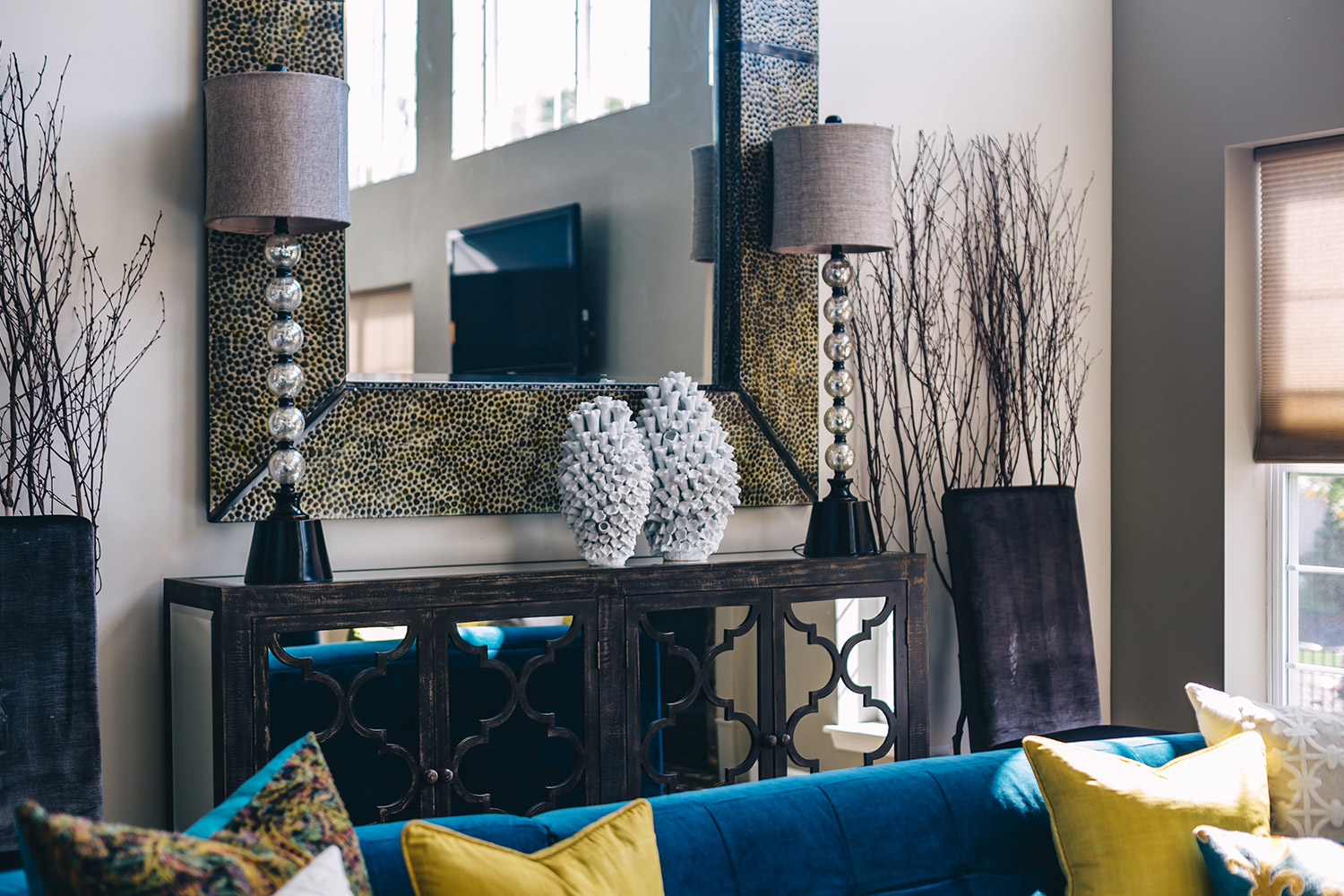
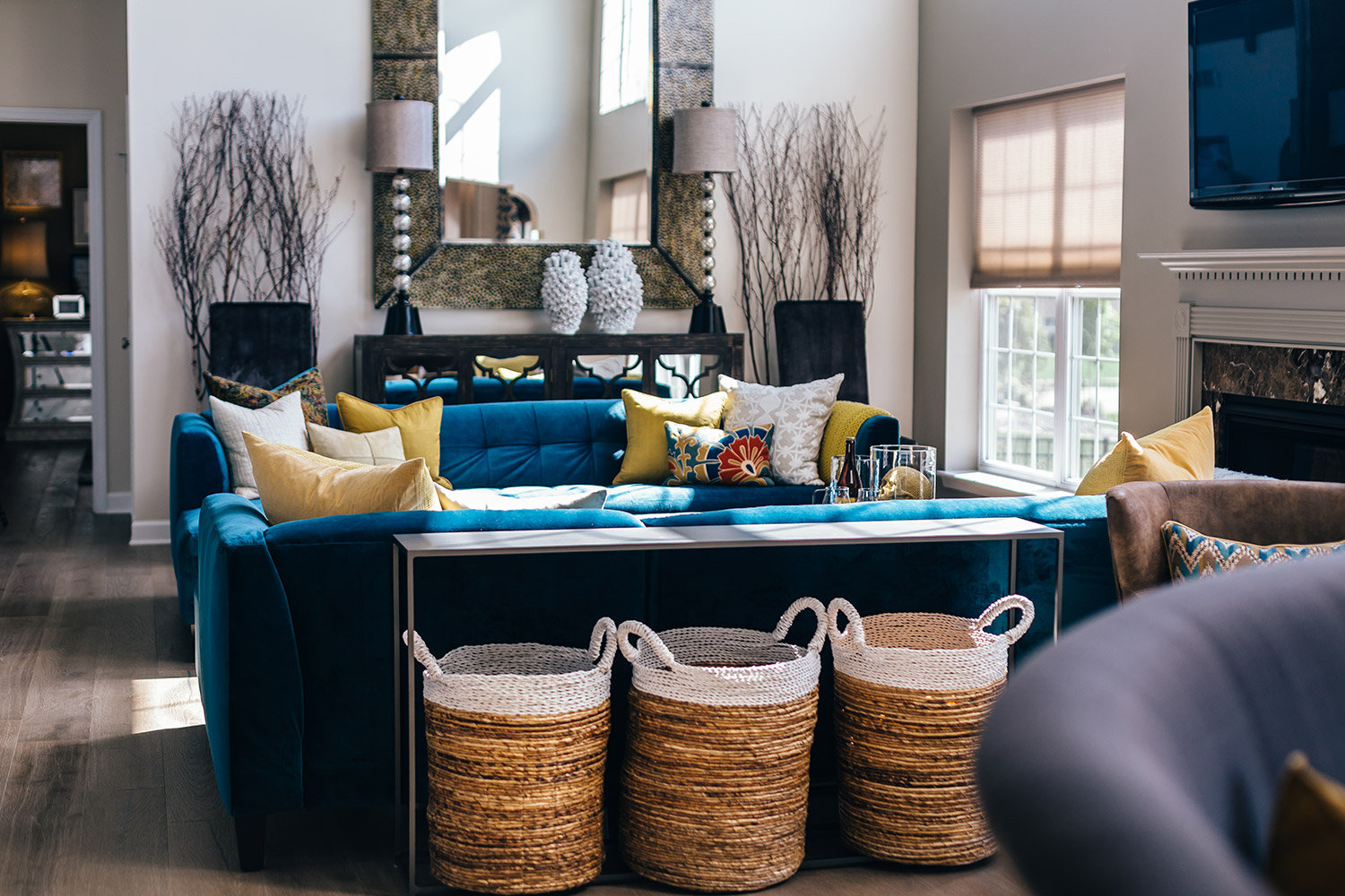
Much of the work accomplished in this home was establishing a visual personality that fit the family’s lifestyle. These homeowners wanted to turn their builder-grade house into a home that completely embodies their individuality.
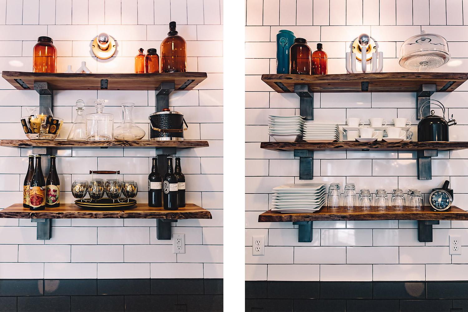
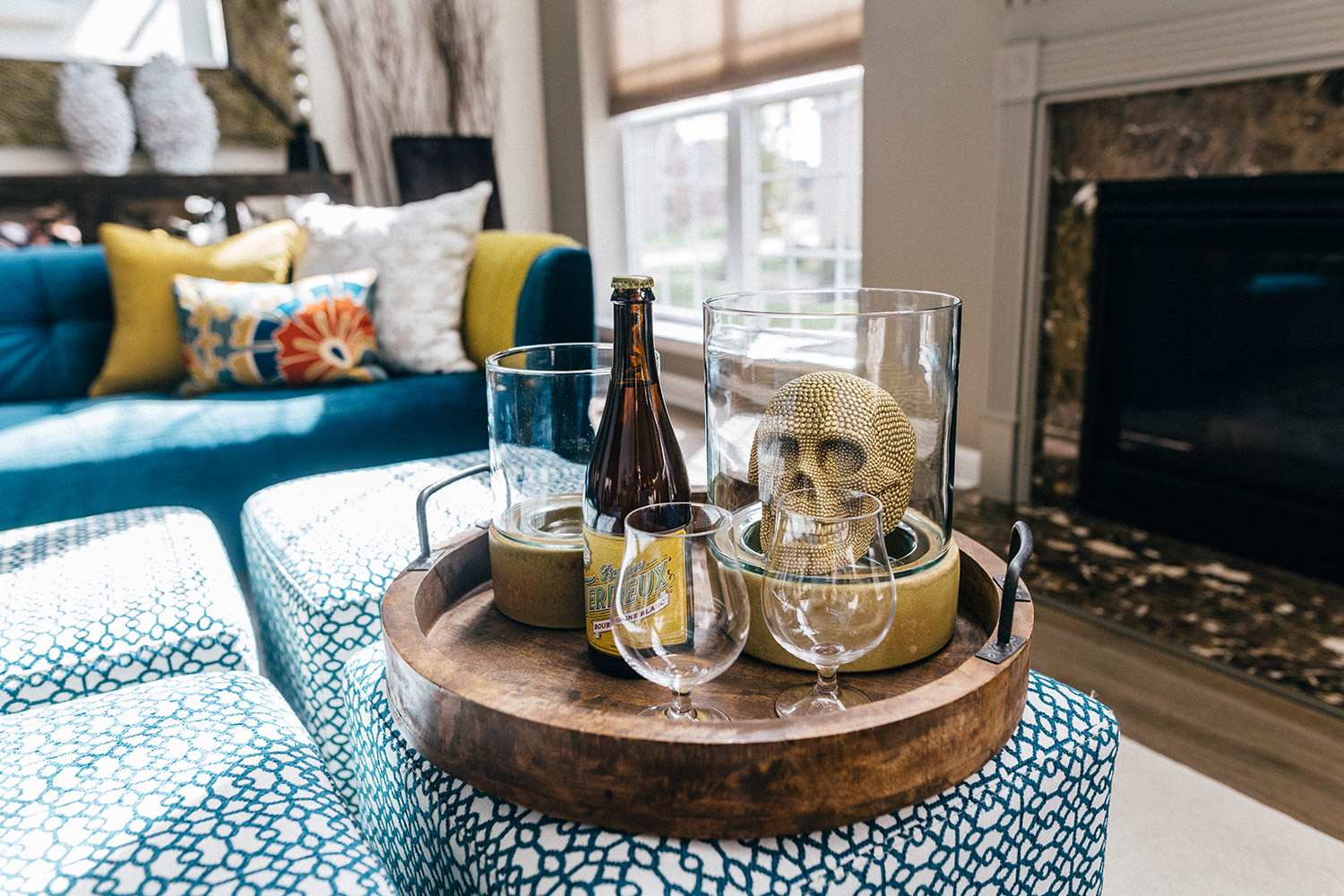
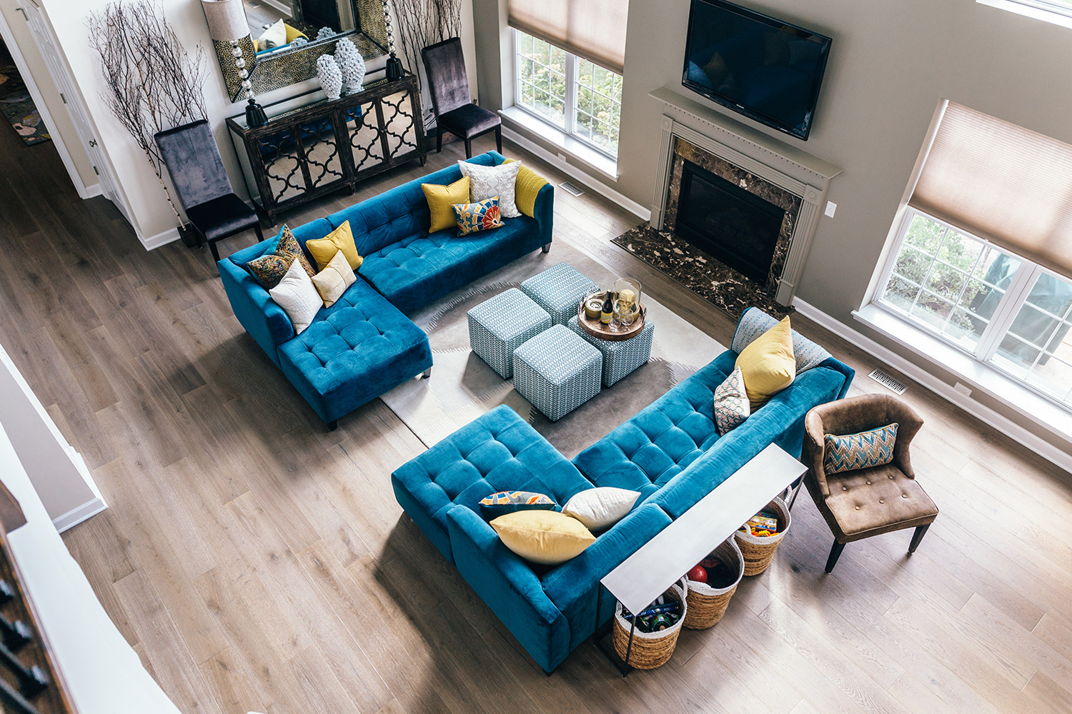
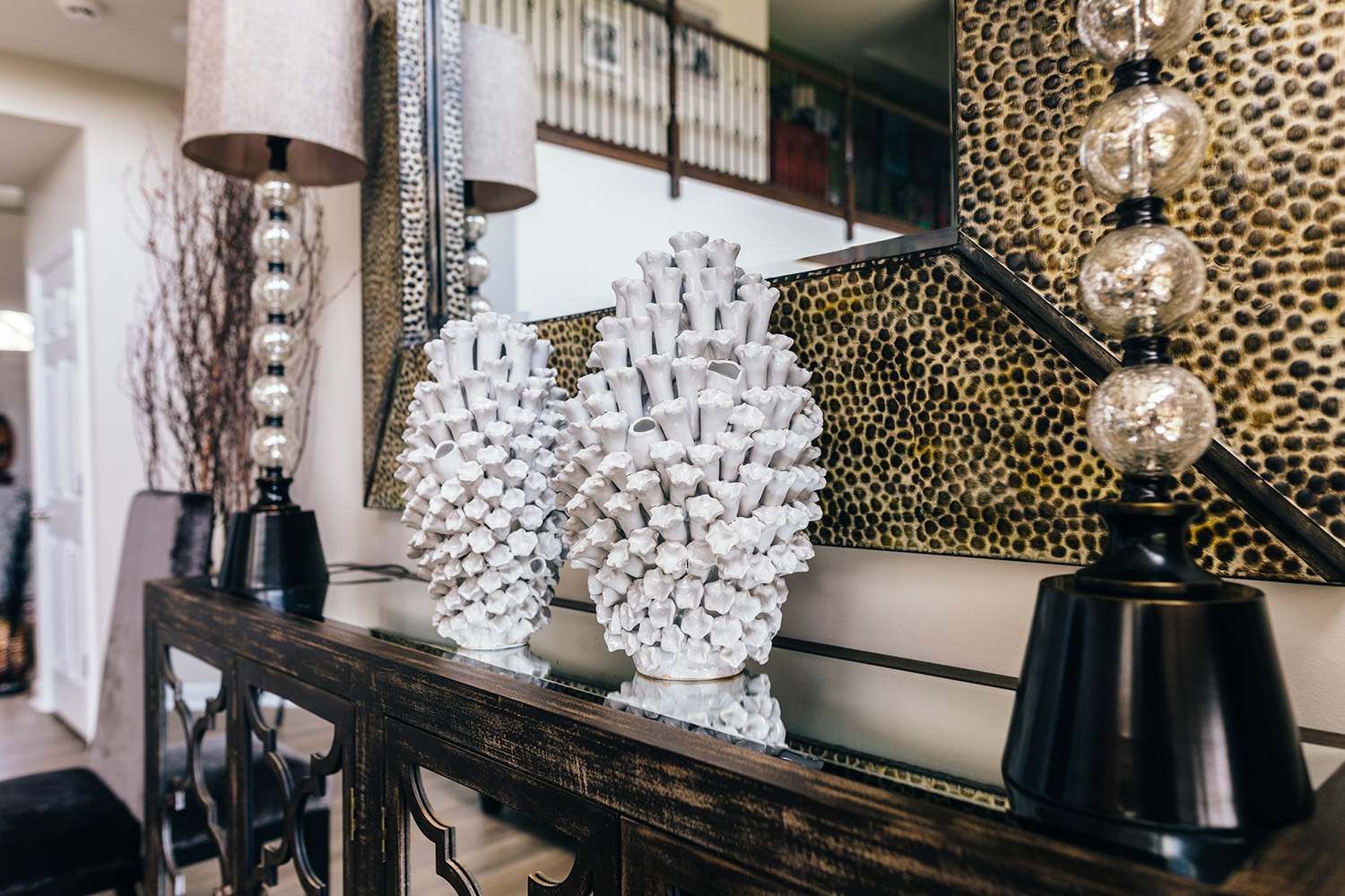
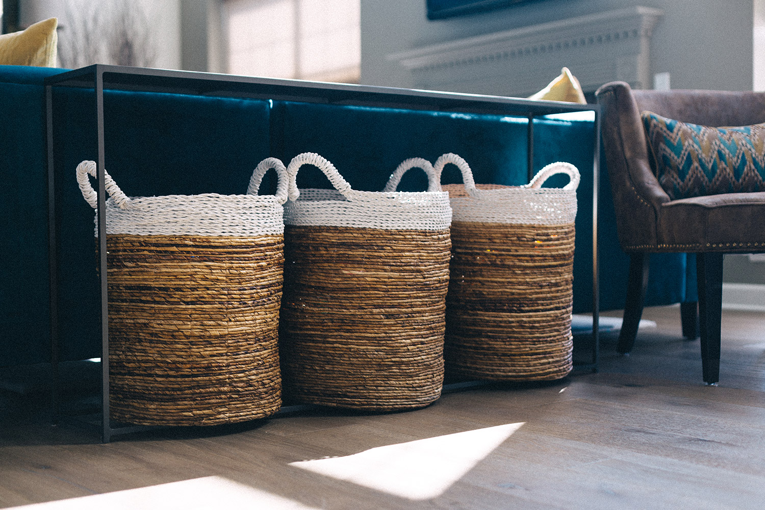
Utilizing elements within the color and furniture of the spaces, along with sleek finishes intermingled with comfortable and bold color palettes, we were able to breathe life into an otherwise traditional, suburban home. Adding another layer to its personality by carefully selecting patterns that play alongside an array of eclectic art and objects, we delivered a one-of-a-kind atmosphere for this client.
We introduced key architectural elements to replace the cookie-cutter features that really brought out underdeveloped aspects that were already present in the home. By removing the columns in the archways and replacing them with drywall corbels, this allowed the house to command a presence with its interiors, while not feeling heavy-handed.
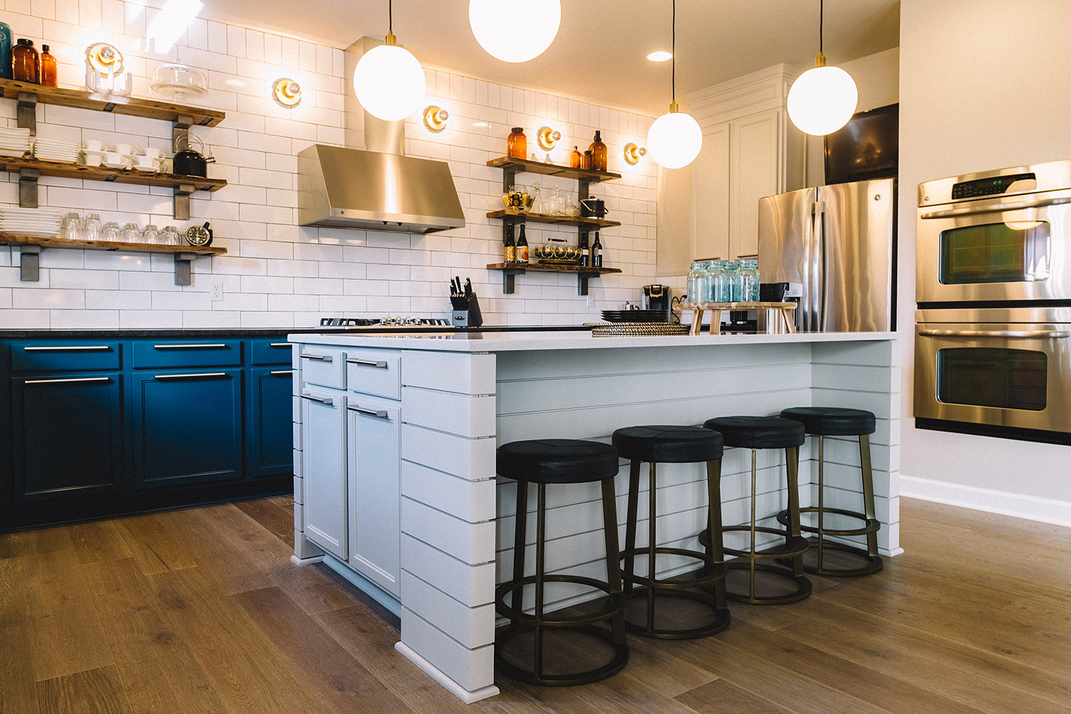
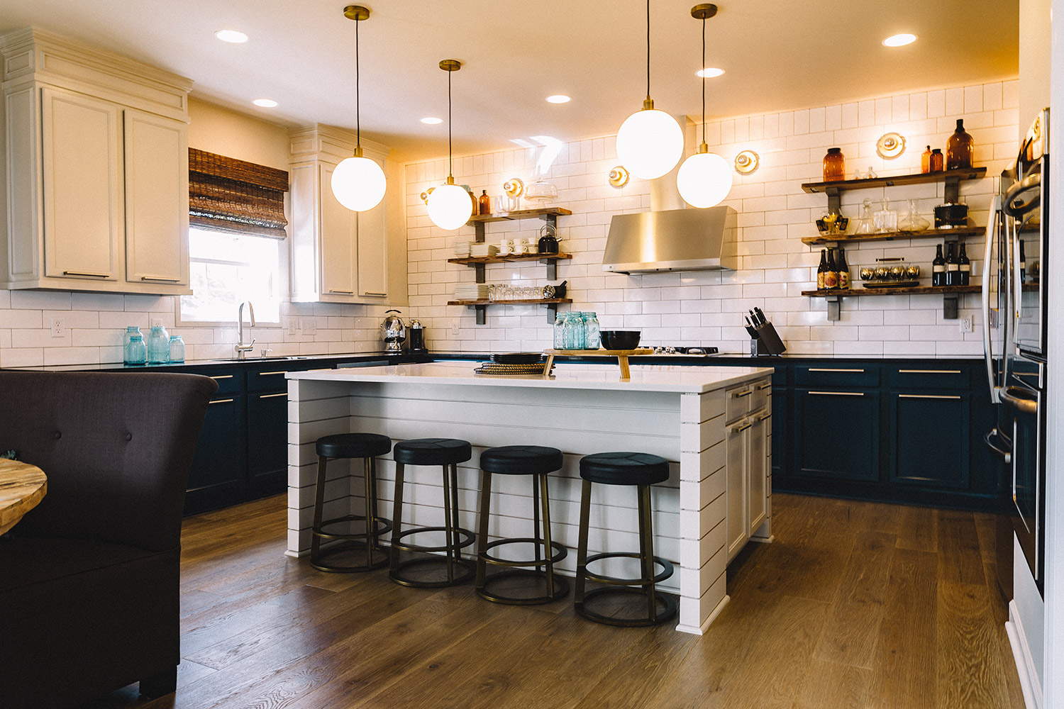
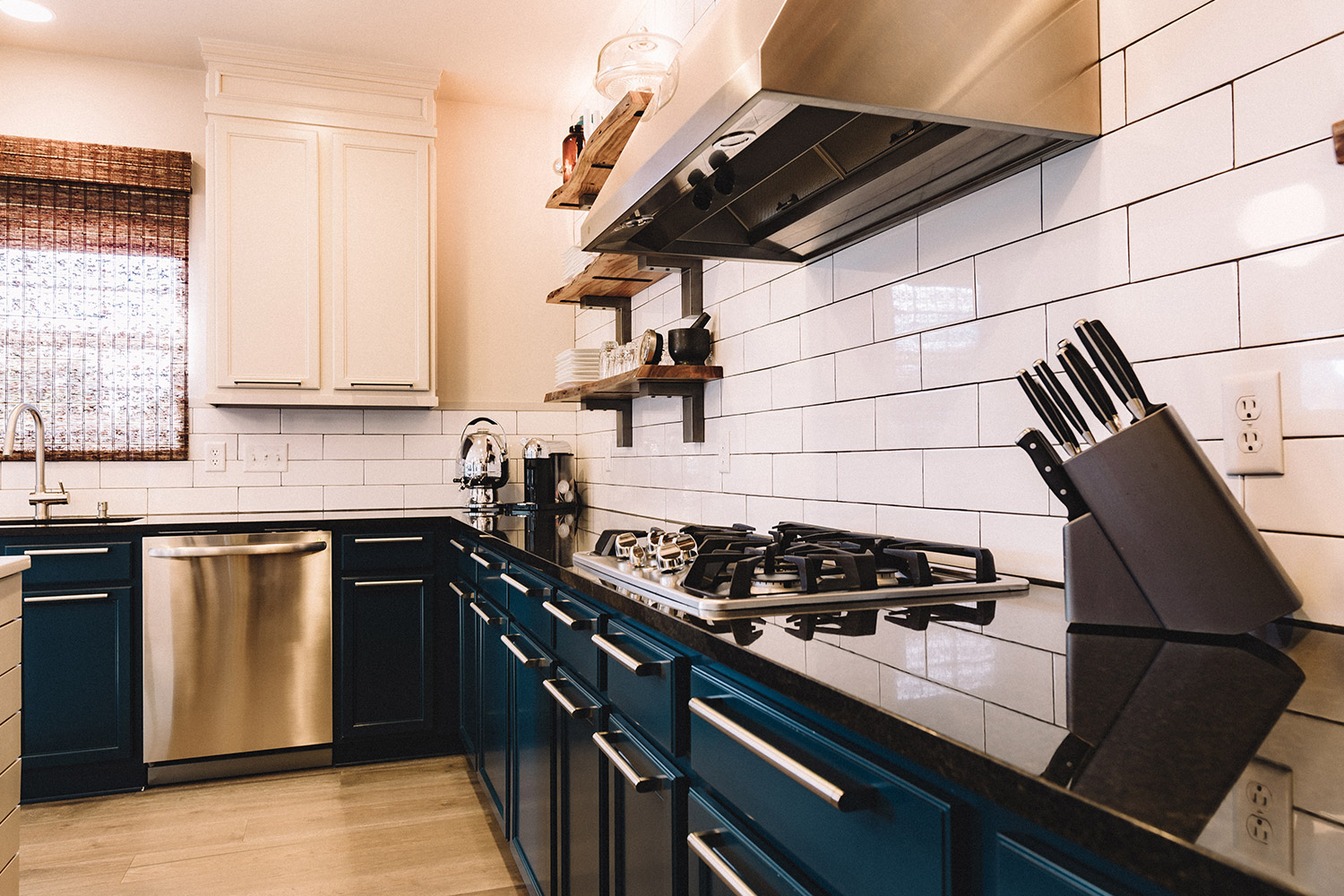
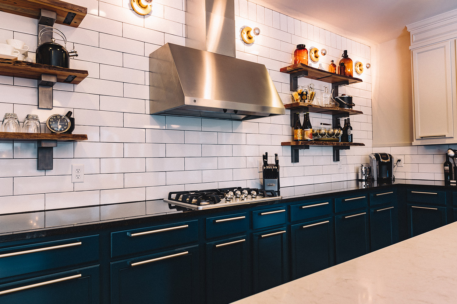
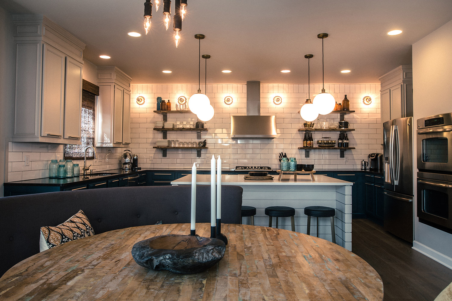
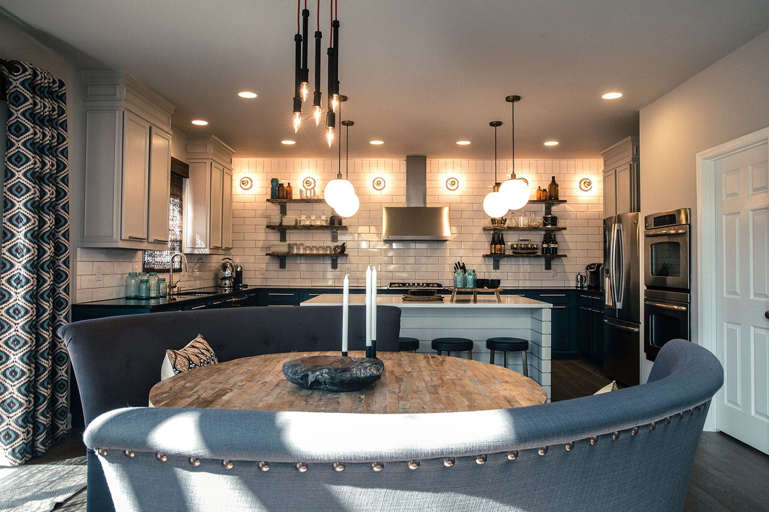
In the kitchen, redundant upper cabinetry was removed and additional millwork was added to the remaining sections, to create a custom look without the clients paying the high premium of custom cabinets. To further maximize the budget, all excess cabinetry removed from the kitchen was repurposed in the laundry overhaul, without the need for additional purchases.
Greymonte is the result of a balanced designer-client collaboration that understands the benefits of phased installments. This method allowed us to refine multiple projects with individual budgets to deliver the final product: a suburban oasis overflowing with their own personality.


