A unique property that’s part of an established neighborhood rich in its history, this two-story townhome was unfortunately riddled with dated design choices that needed to be addressed.
Most clients going into an investment project have a general – sometimes unrealistically low – budget to get the property up to an acceptable level, with minimal changes. Their main goal is to get it market-ready and start turning a profit as quickly as possible.
These clients, however, sought a more holistic approach to the building and the type of tenant they desired. They had a very specific budget, and understood the benefits of prioritizing certain areas and finishes to improve the property, while giving them the most value for their dollar.
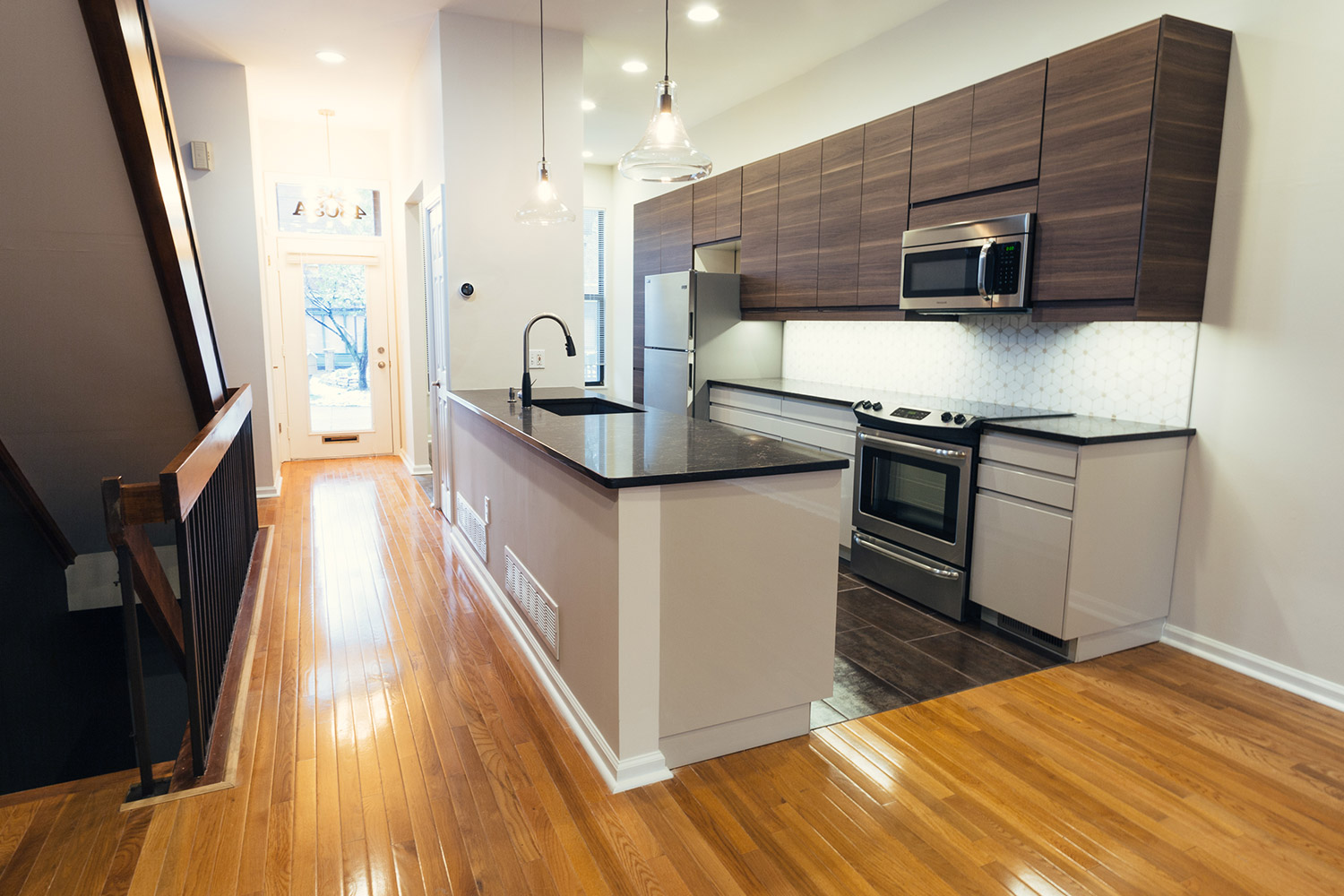
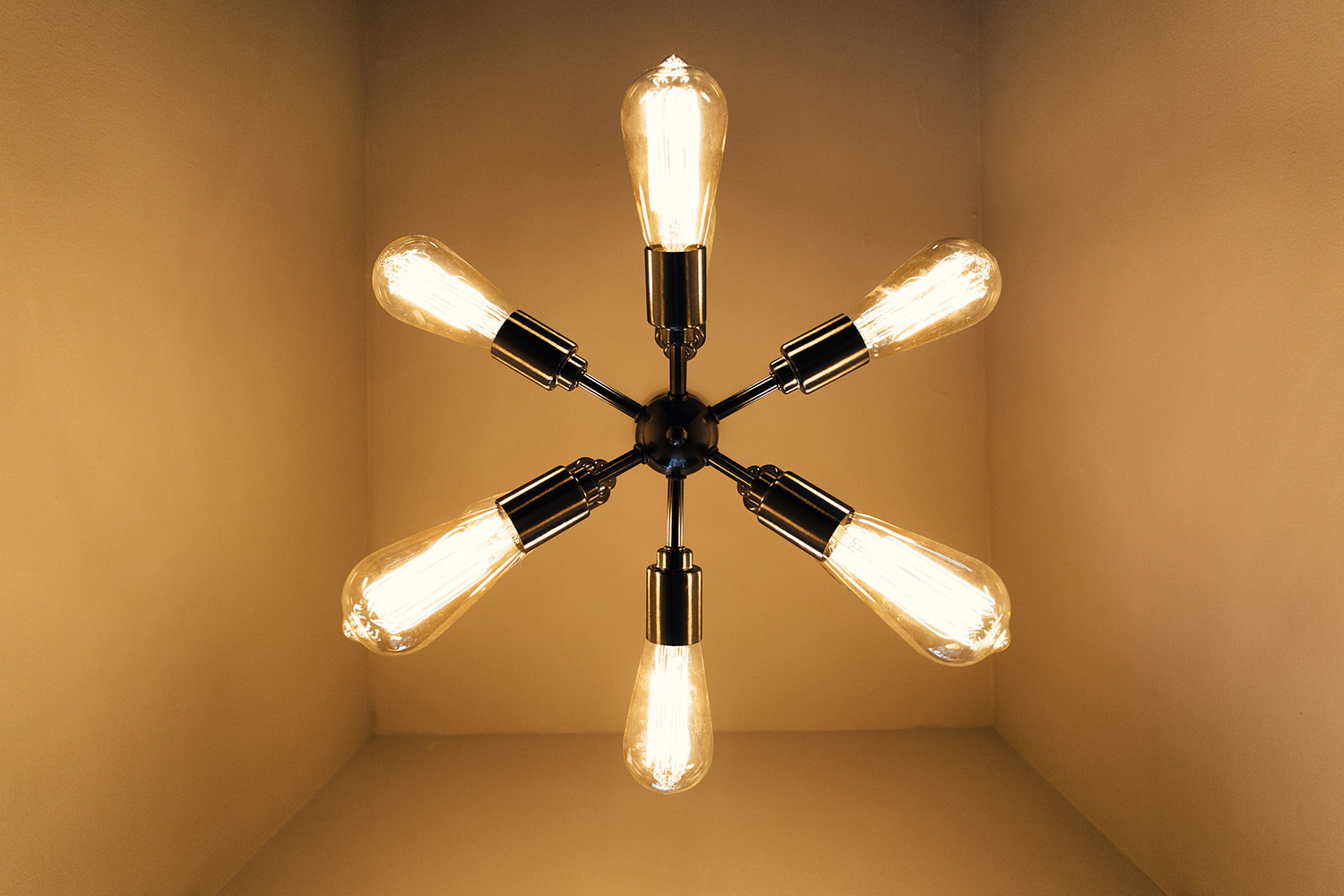
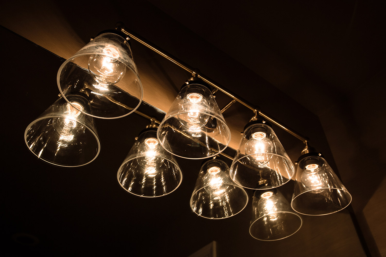
Paint and color choices helped break the space out of its early-2000’s funk, by adding more moody hues and earthy wood tones, as well as polished metal finishes. The careful placement of these selections helped modernize the space while still paying homage to original architectural elements.
The biggest hurdle in this new investment was a poorly renovated, underperforming kitchen. The appeal to bring in more modern polished selections started in the overhaul of the kitchen layout, and utilizing new cabinetry solutions, backsplash, floor tile, and countertop choices. The solution was to create a galley layout in its place, drastically opening up the main floor plan, and significantly improving the circulation.
Minimal involvement from the client allowed this project to be completed under budget, with an accelerated schedule. This ultimately allowed for the property to be listed at an opportune time, and rent quickly to a long-term tenant. Mission accomplished!


