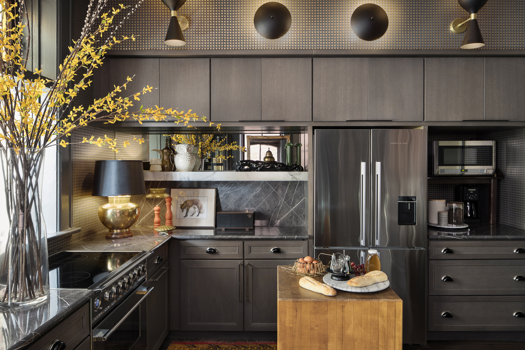
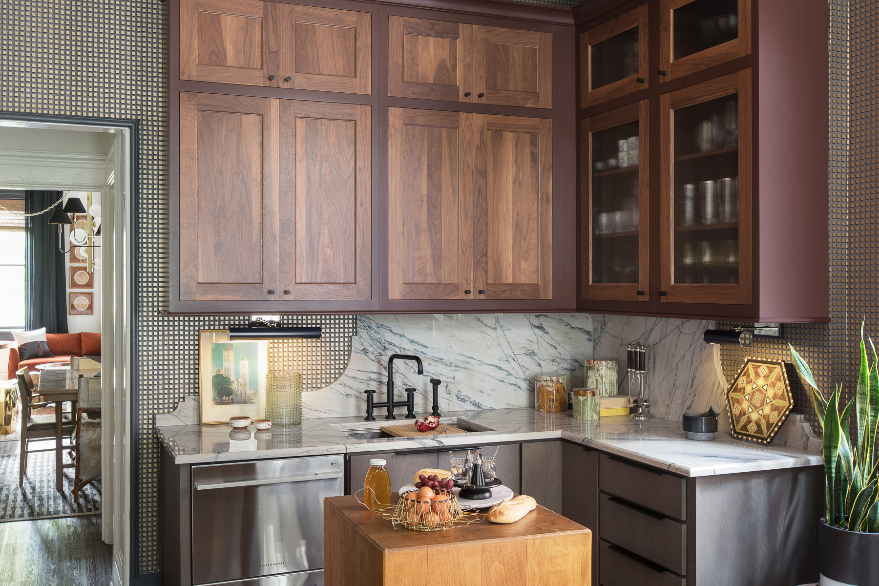
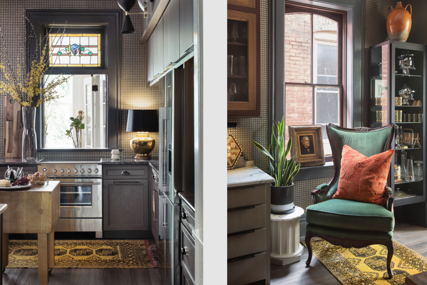
Upon entering this kitchen prior to renovation, there was an odd mix of stock cabinetry, outdated soffits, and many layers of previous inhabitants’ acoutremon. When going through the design process, the main goal was to craft a space that would allow for curated opportunities with display and carved out storage spaces, that allowed for efficiency of everyday life, with living and cooking in mind.
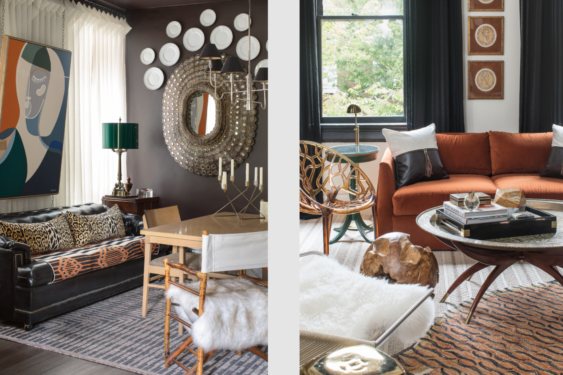
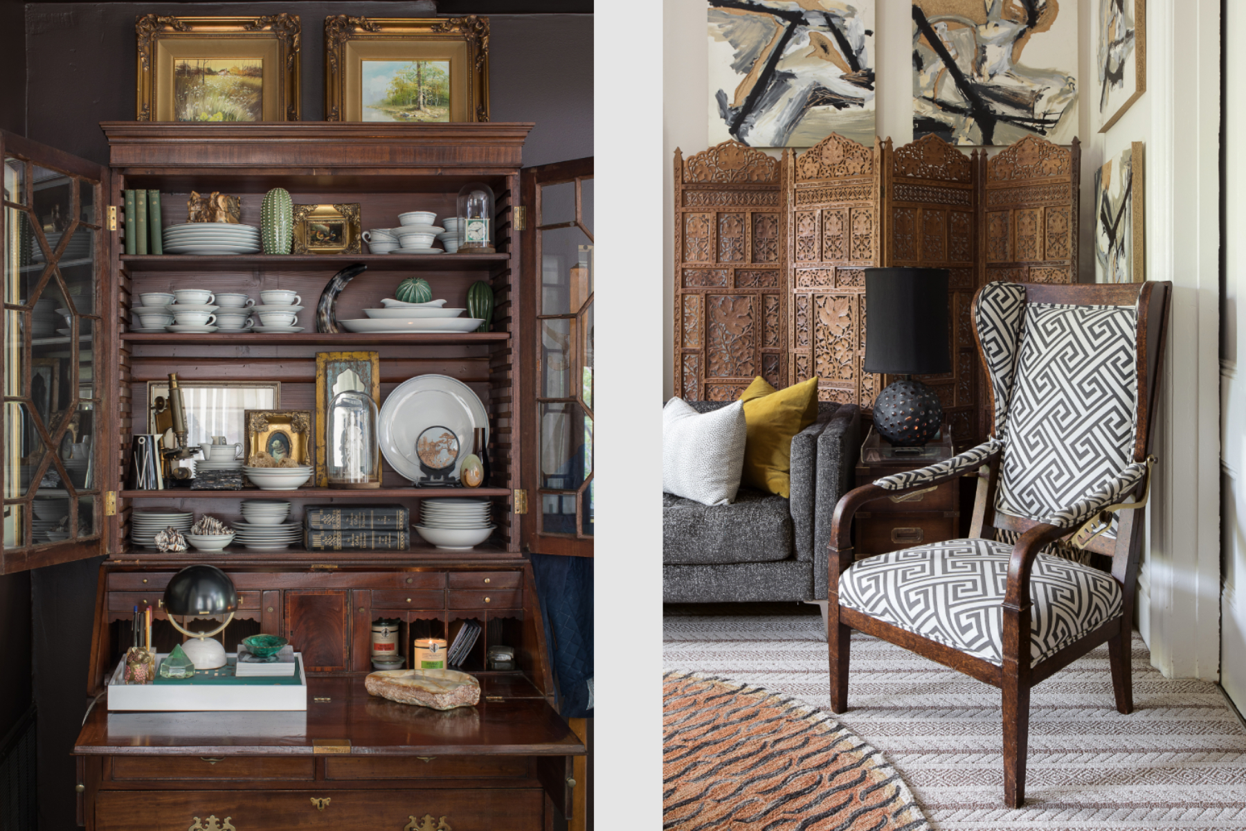
Due to the nature of this space being part of a living/work environment, that doubles as a showroom, there was a great effort put into assembling as many different versions of style, material, and layering to show anyone coming into the space that crafting a mix of this nature, even if the individual items may not all partner well by themselves, they start to speak one language that pulls at the traditional heartstring, with the faintest hints of modern notes.
The best part about this small space, is that even though there was a tight restriction of square footage, it forced the design to be more creative in its approach, which allowed for expansion beyond its four walls, and utilized the tall elevation as a way of expanding the space and really creating a very engaging environment for a multitude of visitors.


