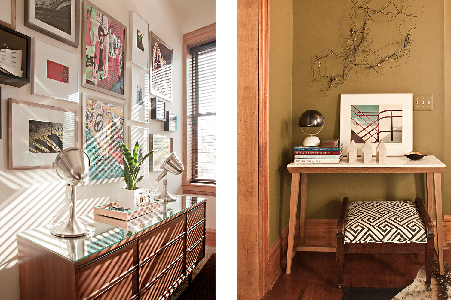
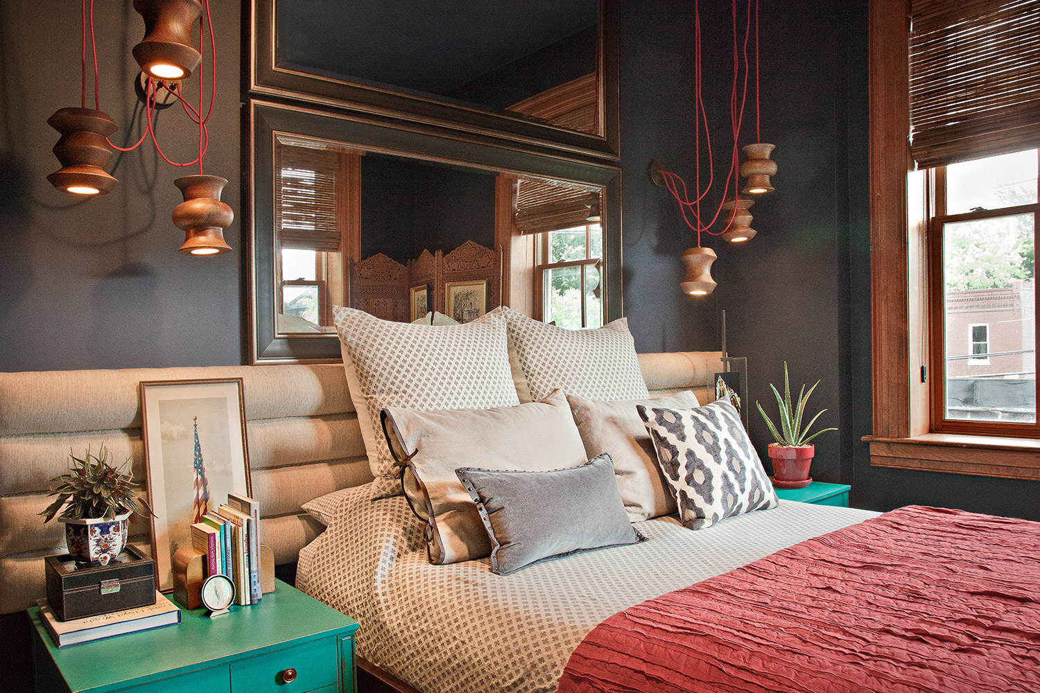
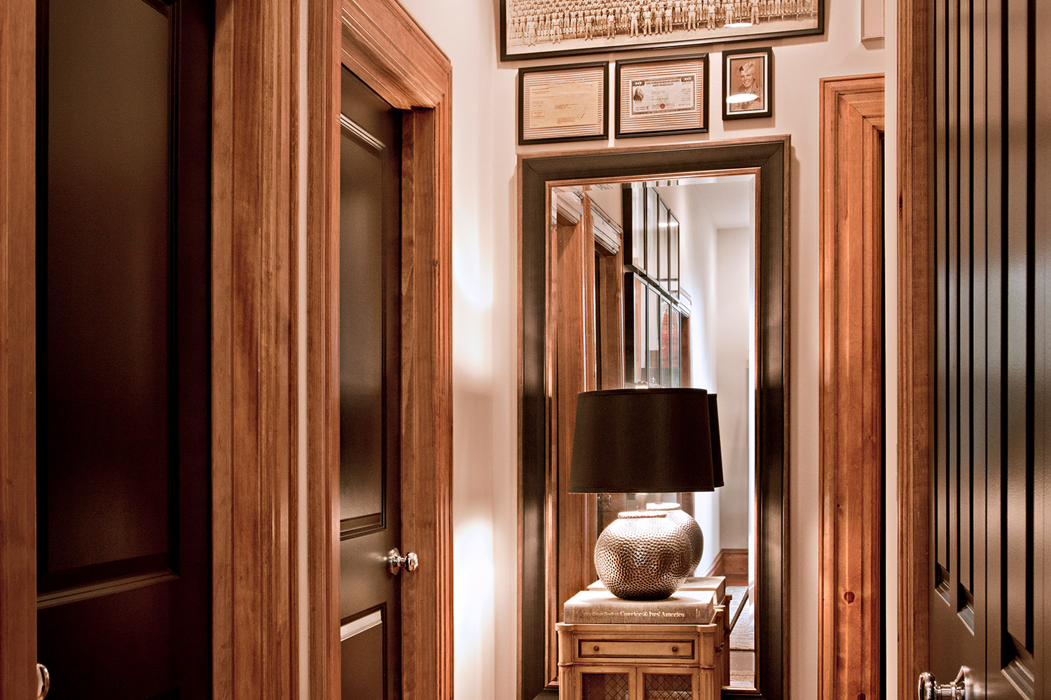
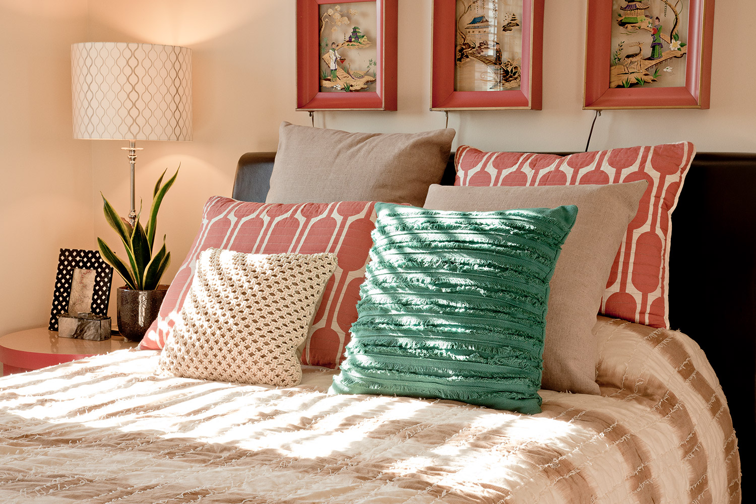
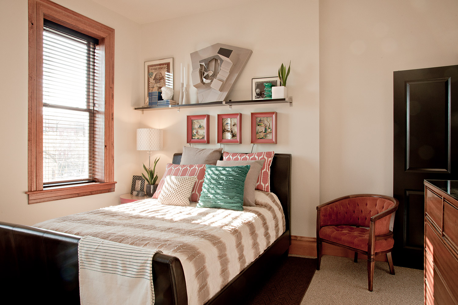
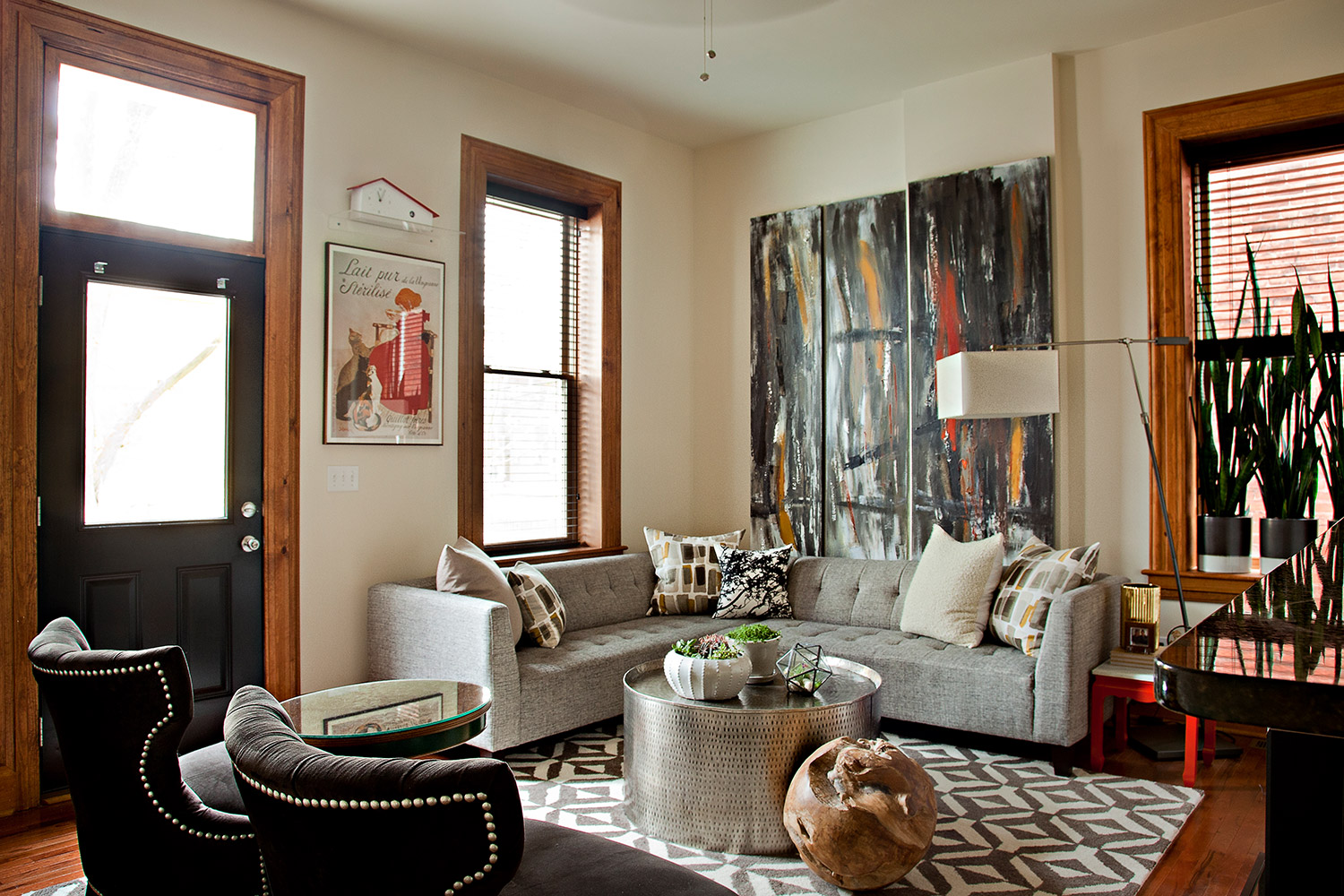
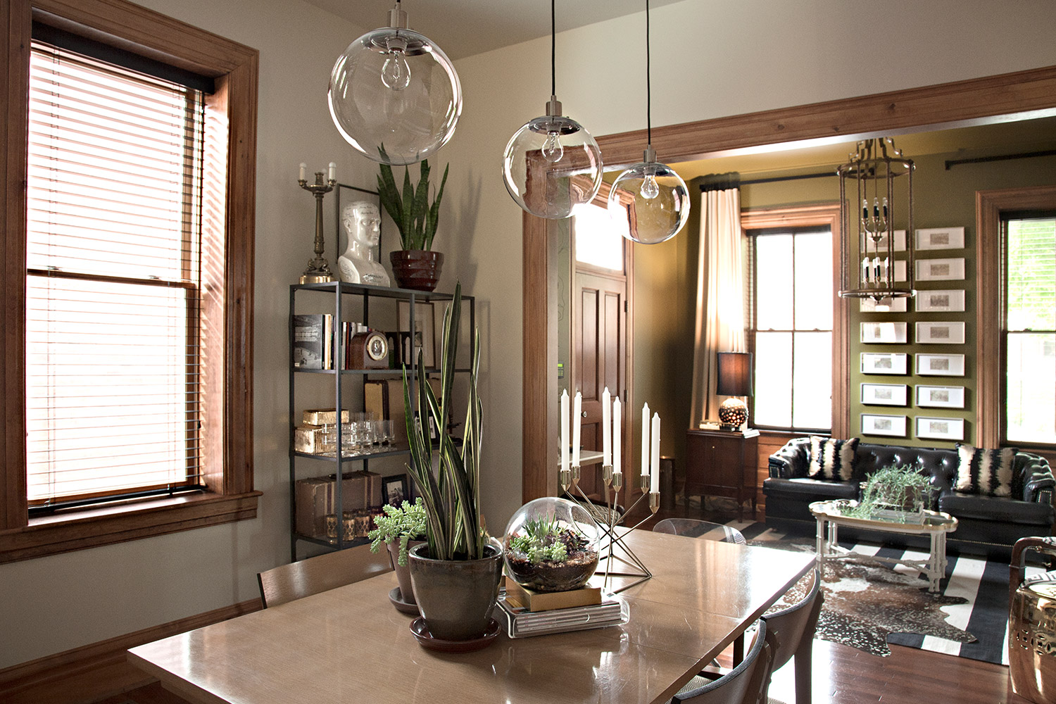
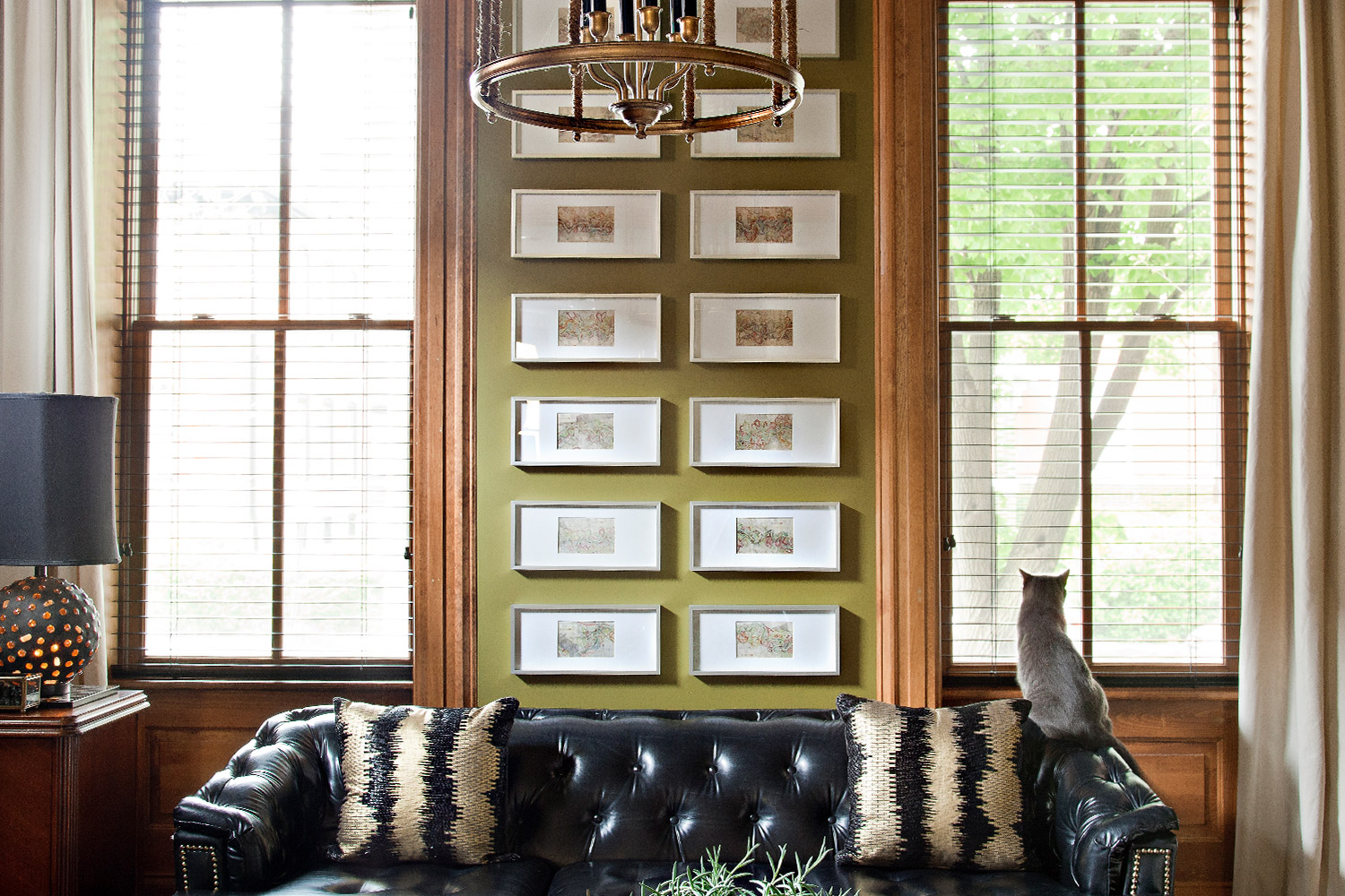
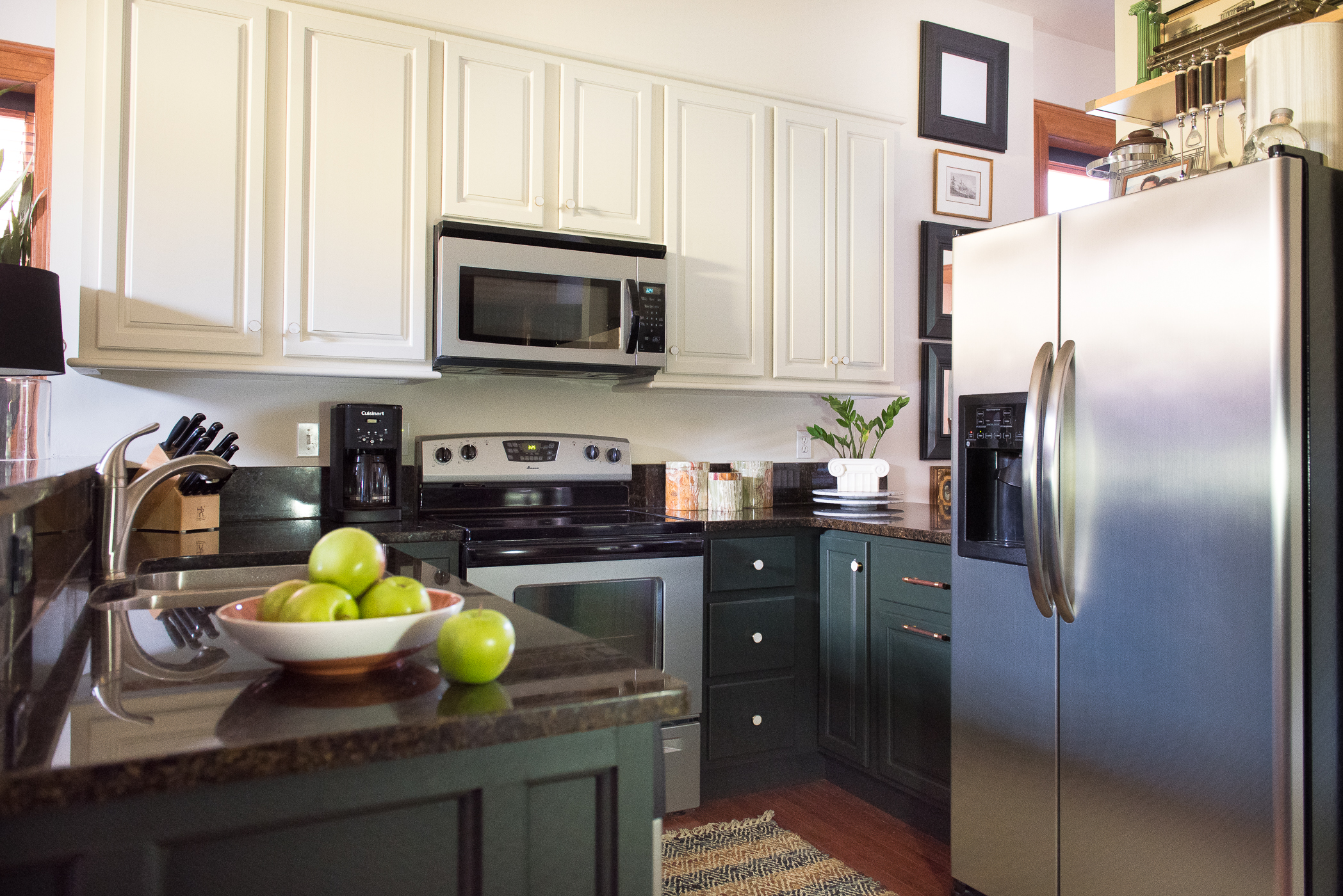
This is much more than a place to rest our heads. It’s the experimental zone for our design, and a place that we can test concepts not as easily approached with most of our clients.
Initially, when we purchased this home, we made a big push to get settled as quickly as possible within a compact timeframe. Our driving motivation was centered around the fact that we didn’t want to be the designers that didn’t even have a finished home or a strong statement about their design and style showcased in our own lives.
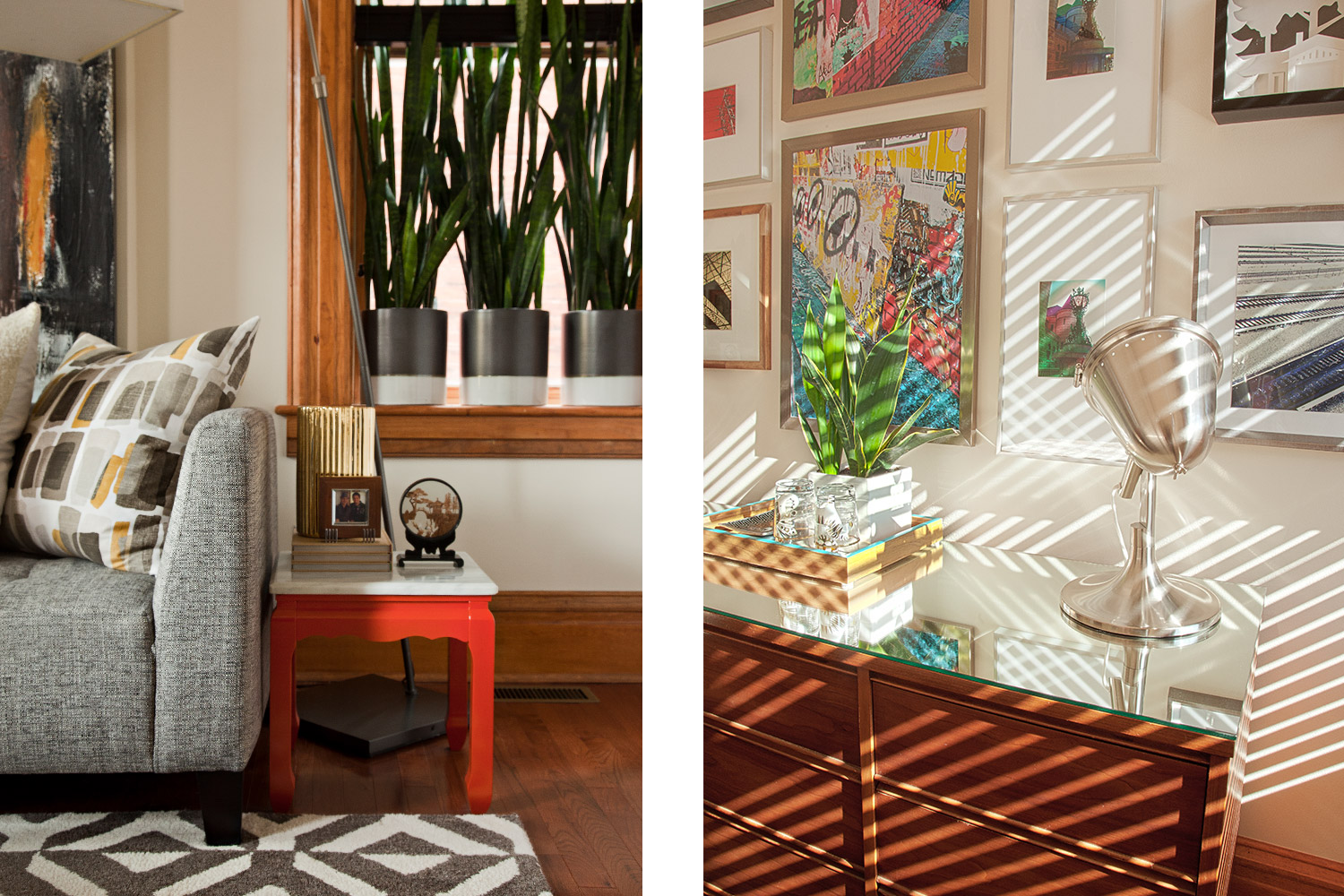
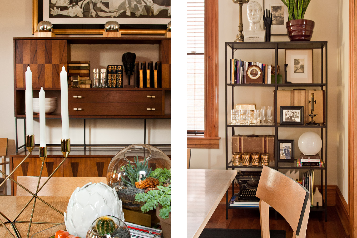
We love mixing old and new, color and pattern, high and low finishes. Each detail is wrapped in specificity. Things like art created by Michael, and furniture pieces refinished by Justin add the extra element of purposeful placement to the overall cohesiveness to our vision. The curation of these carefully selected pieces of artwork and furniture show off our character and personality without using a lot of photographs of us.
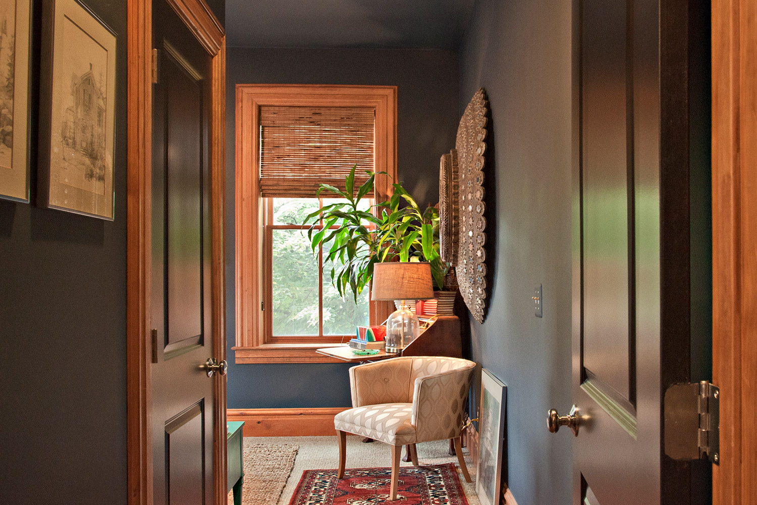
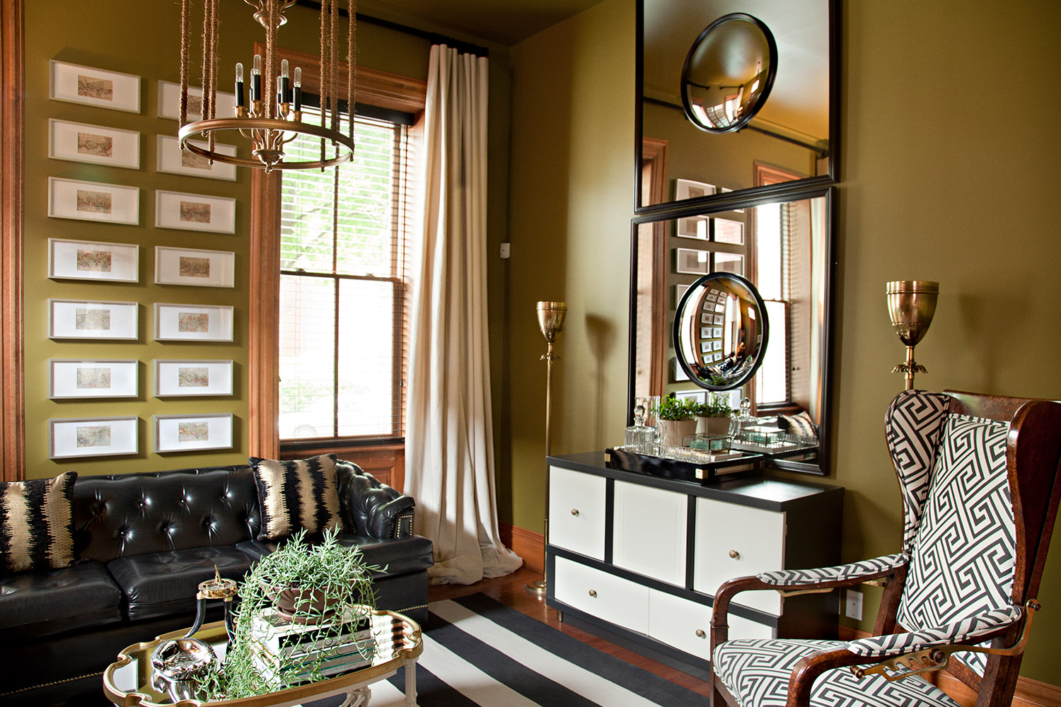
We were very calculated with our use of colors within the very open concept, in turn, giving us a home made up of rooms that were meant to feel more intimate instead of one giant floorplan. With the curation of specific furniture alongside vintage & antique pieces we brought into the design – to play alongside the color selection – to give a very deliberate feel and ambiance.
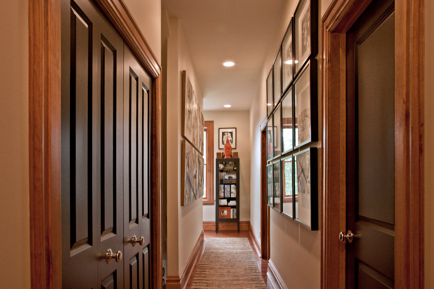
By allowing ourselves to be open to things like unique color choices and bold artwork, we get to enjoy an eclectic visual confluence that is so uniquely us. In every room or around every corner, we never feel like we are in any other place but our home.


